Balanced Color Palettes in Cooking and Art

The principles of color theory are not confined to the canvas; they extend seamlessly into the culinary world, creating a bridge between artistic compositions and visually appealing meals. Understanding and applying these principles can elevate both your artistic creations and your culinary presentations to new heights of aesthetic pleasure.
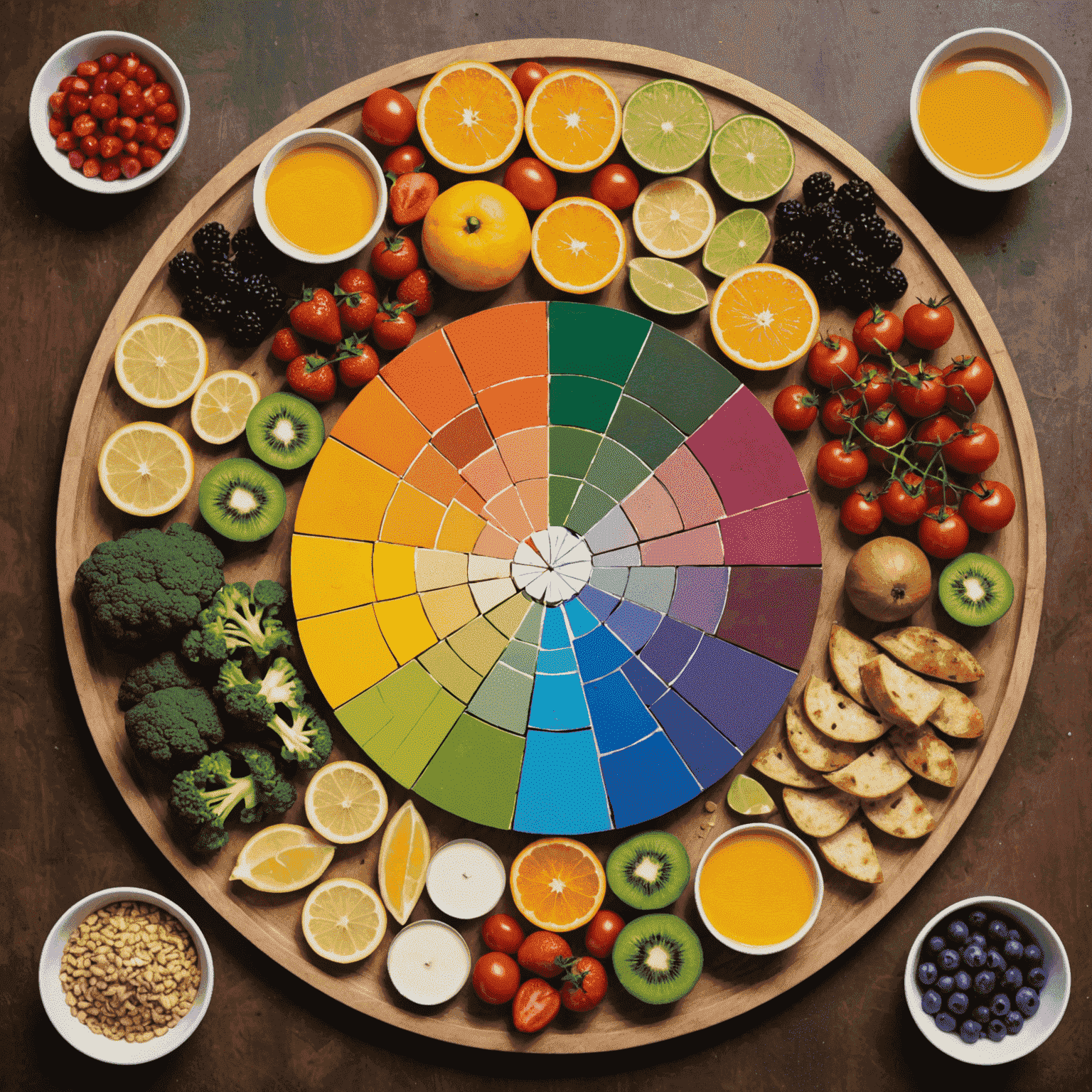
The Color Wheel in Your Kitchen
Just as artists use the color wheel to create harmonious compositions, chefs can utilize this tool to craft visually stunning dishes. Consider the following color relationships:
- Complementary colors: Pairing opposites on the color wheel, like a vibrant tomato soup with a garnish of fresh basil leaves.
- Analogous colors: Using colors that sit next to each other, such as a plate of orange-hued roasted butternut squash, carrots, and sweet potatoes.
- Triadic colors: Selecting three colors evenly spaced on the wheel, like a salad of purple cabbage, yellow bell peppers, and green kale.
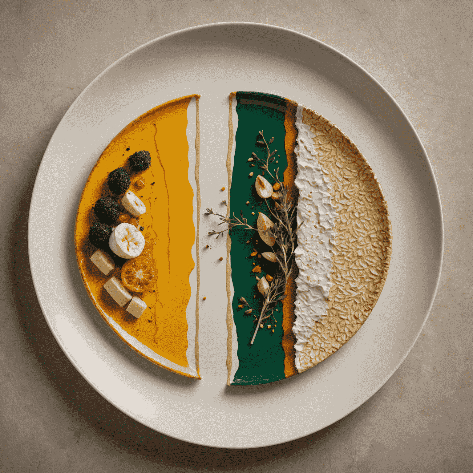
Balancing Act: Proportion and Placement
In both art and cooking, the proportion and placement of colors are crucial. The 60-30-10 rule, often used in interior design, can be applied to plating:
- 60% dominant color (e.g., the main protein or starch)
- 30% secondary color (e.g., vegetables or sauce)
- 10% accent color (e.g., herbs or garnish)
This balance ensures that your dish is visually interesting without becoming overwhelming.
Texture and Color: A Symbiotic Relationship
In both mediums, texture plays a vital role in how we perceive color. A glossy sauce will reflect light differently than a matte vegetable puree, just as a smooth canvas will interact with paint differently than a textured one. Consider how you can use various cooking techniques to alter the texture and, consequently, the visual impact of colors in your dishes.
The Psychology of Color in Food and Art
Colors evoke emotions and associations that can enhance both the viewing and dining experience:
- Red stimulates appetite and passion
- Green suggests freshness and health
- Yellow evokes happiness and energy
- Blue, while rare in natural foods, can be used creatively to suggest coolness or calm
Understanding these associations can help you craft dishes and artworks that not only look beautiful but also evoke specific moods or experiences.
Practical Tips for Colorful Creations
- Start with a neutral base (white plate or canvas) to make colors pop
- Use herbs and edible flowers for natural, vibrant accents
- Experiment with naturally colorful ingredients like beets, turmeric, or butterfly pea flower
- Consider the entire composition, including the serving vessel or frame
- Play with negative space to create balance and focus
By applying these principles of color theory, you can create dishes that are not only delicious but visually captivating, and artworks that resonate with the same harmony found in a perfectly plated meal. Remember, whether you're wielding a paintbrush or a chef's knife, you're creating an experience that engages all the senses, with color as your guide to symmetry and balance.